.jpg)
OPEN HOUSE - A REAL ESTATE APP
Summary
Open House is a real estate portal that focus’s on accessibility and transparency for both tenants and landlords. In the new normal, in person viewings aren’t always possible whether that’s due to social distancing measures or because people are moving country. With Open House, landlords are provided easy to use tools to create interactive online tours for all their properties to give the best possible online viewing experience to their potential tenants.
My Role
UX Designer
Duration
4 weeks
Design Process
1
Research
2
Define
3
Ideation
4
Design
5
User Testing
The Brief
The users of Open House consist of both landlords and tennants. The main requirement was to build an accessible tool to create interactive property adverts. Providing this easy to use tool will in-turn make interactive tours more common place allowing potential tenants to make more educated decisions.
User Goals
-
Users need tools that allow them to demonstrate what tenants want to see when advertising a property
-
Users need to be able to give tenants the confidence before agreeing to rent so that they don’t feel deceived
-
Users need to gain a better sense of the dimension and scale of properties they are viewing online so that they know it is big enough for all their furniture
-
Users need to gain a better feeling of the area a property is in, so they know they are safe living there
User Interviews
For my user interviews I spoke to a range of different people who had recently been involved in the property market. This included a person trying to sublet a room in their house, a person who both manages an Airbnb property and is also currently looking for a place to rent, a couple who started renting a flat during the pandemic and another person who also started renting a flat during the pandemic and is also looking to purchase a house.
-
The questions I asked for my user research were the following:
-
What involvement have you had recently in the property market?
-
Which company/service did you use?
-
How, if at all, did the covid-19 pandemic effect your experience viewing the property?
-
How would you describe your online experience of viewing/advertising a property?
-
How would you compare your experience of online viewings to in person viewings?
-
Did an online viewing effect your confidence in renting/purchasing in any way?
Affinity Map
My questions intentionally were open ended and not leading. The interviews were a success, I captured a lot of valuable user data that allowed me to create the goals from the previous page. With the data I created an Afinity Map that really highlighted the key areas that needed adressing such as interactive tours, dimensions & scale and trust and confidence.

Personas
Personas are a technique that I have used many times for various projects in the past. As I aimed to create an end to end solution for online property viewings, I initally had two primary personas instead of just one, landlords and tennants.


User Journey
There are 3 main user journeys in Open House:
Onboarding:
Open house uses a benefit oriented onboarding experience, by demonstrating to the user what they gain from using the app, I hope that will encourage more sign ups and more users.
Creating an ad and interactive tour:
This is the most important user journey in the apps UX as it is the main focus of the problem statement. If it is hard to create an interactive tour then the app is pointless. Mapping this process out early allowed for a lot of consideration into potential pain points for users.
Previewing an ad and interactive tour:
This user journey is important to both the primary and secondary personas. Landlords need to be given the confidence that their ad is going to be displayed how they want it to and tenants need

Low Fidelity Wireframes
The scope of my first prototype included:
-
Onboarding / Account Creation & Login)
-
Create an Ad
-
Create an interactive tour
-
Preview Tour
The low fidelity wireframes were produced in Figma and are interactive allowing for them to be used in Usability Testing. One area that I struggled with was finding where the line is when it comes to fidelity and context. On one hand as a low fidelity prototype you don’t want to be spending too long on each screen as it will more than likely need changing after testing. However the users need enough context during testing for them to understand what each element is and what they need to do next to accomplish their goals. The balance I found for this was to include labels and icons however no other visual design elements.

Usability Testing
Goal: Test the usability of creating an account, advert, interactive tour and previewing it.
Test tasks:
-
List the benefits to creating an account
-
Create an account
-
Create an ad for a two bedroom flat including an interactive tour
-
Preview your ad
Metrics:
-
Success = 3/4 tasks completed
-
Time required to complete each task (less than 2 minutes)
-
Error rate = 1 per task
-
Users subjective satisfaction

Design System
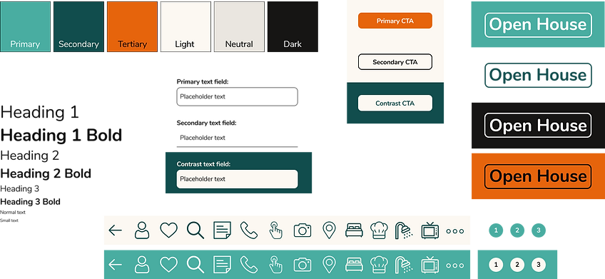
Creating a design system before creating the high fidelity prototype meant that I could make design decisions in advance so when it came to creating prototype I just needed to drag and drop the individual components.

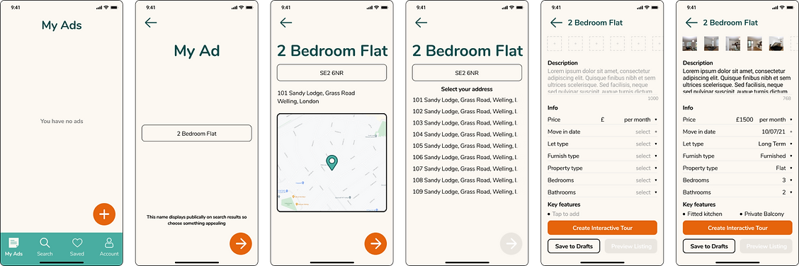
Final Design


Learnings
-
One of my biggest learnings from this project was that how well a team works together really makes or breaks a project.
-
Being able to explore without getting attached to a particular design was very helpful for us to think objectively.
-
the last but not the least thing I learned was a genuine interest in the work you’re doing will be the biggest motivation. Since our dev team was in India, we had to work at odd hours to accommodate the time difference but the team’s passion in this project was so motivating that we didn’t mind that schedule at all.